BLAB: Natural light or flash and why?
JC: Almost without fail, flash. However, if you'd asked "available light or flash?" the answer would be "both".
There have been two things which really changed my photography. One of these was digital cameras, which makes the learning process so much easier (and removed film processing companies from the loop mercifully). The other was studio flash. Learning about flash really opened my eyes to light as a whole in photography, funny though it may sound - before that point I just took what light there was and consequently I have many mediocre landscape photos to show for it. Studio lights put me back in control and reinvigorated my interest in photography - but more than that, once you learn to control light you also learn how to see light. I think learning about flash is one of the greatest things any photographer can do, after studying composition. I think this is part of the success story of Strobist - it's not only that David Hobby is teaching people how to use flash, but he teaches them how to see and study light.
To get back to topic, I tend to approach any photographic problem as an exercise in using flash. I can't help myself, it's fun and I just like how flash looks in a picture, especially the ability to get soft-but-not-flat light sources. I do much of my photography in a studio, so I can craft my light from scratch. When faced with natural light I tend to work out how to minimise its impact so I can bring out the flashguns and shift the highlight of an image. Having said that, I am increasingly looking to blend available light, especially artificial light sources, with flash. And there are some occasions, such as at gigs, where available light is better than reconstructing the scene using flash.
So I guess the answer is rather unhelpfully, whatever is most appropriate to the picture.
... and flash.
BLAB: Which photographer's work do you most admire and why?
This is a very difficult question. There are so many photographers producing great work now and I find the ones I admire most change quite rapidly. Chiefly I look for photographers within my own field; landscapes are great too, but I photograph what I like to see. I make a point of looking at a lot of other photos, to get ideas, study technique and also plot a path to my own style. I'm trying to avoid copying other artists and, though I do praise Strobist, I want to avoid the "Strobist look" that has become quite common on the web.
That said, if pushed to name my influences, I'd have to cite two photographers, unfortunately you may find some of their images not safe for work, you have been warned:
Nadya Lev - her work was a strong inspiration for some time and even now I find it highly inspiring. Her work is fairly hard to place, but high-fashion with historical themes and fetish overtones might get close. My early experiments with gels and gothic fashion were largely brought on by seeing her work.
Lithium Picnic who also has a large body of work on deviantart.com - LP is in a similar line to Nadya Lev, with strong fashion and glamour pictures with varying levels of fetish fashion scattered around. Where Nadya Lev produces bright works with strong colours and simple constructs, LP produces darker and more complex pictures with more subtlty. I wouldn't say Lithium Picnic was necessarily better than Nadya Lev or vice versa, but I think I discovered his work at a time when I was looking to produce more complex images myself. LP is very much a target for my pictures, not so much in content but in look, feel and production values.
BLAB: Which of your images means the most to you and why?
Many of the photos that mean the most to me are little better than holiday snaps, but they represent people, places and things that were important in my life. As a photo, they aren't so valuable.
At risk of sounding a bit "arty", I think this is where the highly constructed images I make differ from, say, journalistic images. Because I am photographing constructed scenes, especially ones that may not exist beyond the duration of the flash, the image content has no direct meaning to me. I saw the studio that day and it wasn't anything special. Instead the photo is judged on its final quality - does it capture a mood or a look, is it stylish or attractive? And because I'm aiming to improve all the time, the image that means the most to me changes all the time, usually to the most recent image made.
I worry when my most recent images don't mean the most to me!
There is one big exception though. Two of my friends got married at the end of last year and asked me to be their wedding photographer. We did some lovely posed shots with flash inside the wedding venue. This was a wonderful chance to capture a memory and also dress it up in light. There's something very special about capturing a beautiful image of a beautiful memory.
BLAB: What would your dream photo opportunity be?
So many to choose from, but if Gothic Beauty magazine phoned up and asked me to do a cover, I wouldn't be complaining!
BLAB: What colour would your Ferrari be?
JC: Black, but with plenty of shadow detail. ;)
Anything else..?
These are very exciting times for photography since the rise of digital cameras and photo sites like Flickr and Deviant Art. There's an incredible amount of high quality photography out there. The best part is that not only is photography more accessible but learning about photography is more accessible. I wish Flickr, Strobist, Cambridge in Colour and so many other sites existed when I started in photography - maybe I'd have fewer boxes of mediocre landscape photos.
With all this photography around, there is a real issue about how you differentiate yourself. When I started in portraiture, I rapidly became bored as it all started to look the same. I started becoming interested in fashion photography and in particular gothic fashion, playing with different styles and variations from the alternative photography and fashion communities. There's an interesting trend now for mainstream fashion to borrow increasingly from these communities, but I like to think that it still gives my images original themes. I love working with the extended conventions of the alternative scene in any case so I can't see me stopping that any time soon.
I once attended a photography seminar where the organiser asked "Who takes photos because they can't draw?" Everyone put their hand up. I think flash photography really opens up the possibility to be massively more creative. Certainly the turning point for my photography was discovering studio photography. Prior to that I didn't find people very interesting subjects, but this introduction to a world where I could construct the entire picture, from selecting models to placing them in light that I controlled, added the important creative element that I was missing before.
There's a great comment I saw from Chase Jarvis originally and many other people since. He said, there's two kinds of photographer - image takers and image makers. I would definitely say I'm on the image maker side. Going digital has been a huge boon as now the image making can happen after the camera - I know some experienced photographers dislike doing their own post processing and consider edits to be cheating, but I consider digital workflow a huge advantage. Photoshop is a great tool and most of my portfolio images pass through Photoshop at some point. The trick is getting good quality images going into the workflow then being subtle in the changes. I've been through many dilemmas of Photoshop vs in-camera editing before realising that both sides have something to offer.
BLAB: Ok but what about photos, got any pictures you'd like to show us?
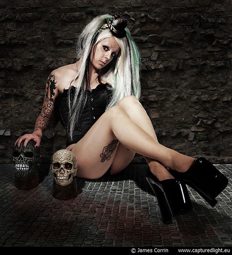
http://www.flickr.com/photos/captured_light/2848742273/in/set-72157603348085520/
This image of Ethel Hallow is one of my favourites and she's always great to work with. This image also represents one of my biggest Photoshop edits to date. I couldn't find a good backdrop for her so took this picture on a white seamless studio backdrop. The original image was subtly lit and brought into Photoshop as a low-contrast image. I then took some segments of wall and floor from some holiday snaps and extended them across the picture, adding contrast and highlighting as I went. The advantage of shooting on white originally was that the shadows of Ethel on the floor effectively come for free through Photoshop blend modes. ... The skulls are real by the way, in as much as they are kickable objects in the scene with Ethel.
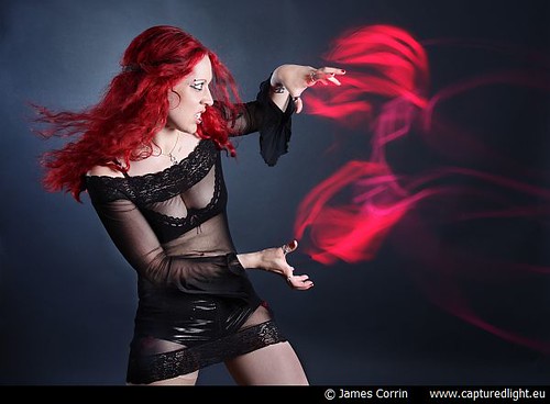
http://www.flickr.com/photos/captured_light/2848742135/in/set-72157603348085520/
This photo amuses me because most people assume the red light was created in Photoshop. In fact, though the image has been edited slightly, the red light is created using glowsticks. The entire image was a 30 second exposure with willing model Skarlett Venom standing still in a dark room while I waved glowsticks in the air in front of her. Towards the end of the 30 seconds I jumped out of the way and fired three studio lights - one softbox from Skarlett's front, one hair light to the left and a blue gelled light on a black paper backdrop.
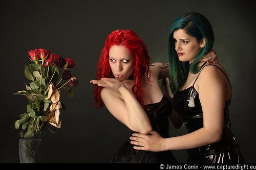
http://www.flickr.com/photos/captured_light/2079023381/in/set-72157603348085520/
One of my early, big-team studio efforts and my first time with a makeup artist on set. No-one quite seems to get the concept I had in mind for this shot, but so far it's fairly well received. Thanks to the cooperation of Skarlett Venom and Indira Diabola, not much editing was required on this image. The only big change was the vase - I couldn't find an interesting vase before the shoot so had someone hold the flowers up and drew a vase in Photoshop over the hand after the event. I've learnt more about drawing through Photoshop than anywhere else.
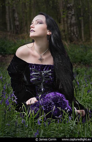
http://www.flickr.com/photos/captured_light/3168339659/in/set-72157603352325505/
This simple photo was taken outside on an overcast day. It's fairly true to the real view, but I did use a flashgun with brolly top-left to get a directional light on Amaranth's face. I've invested in a few Canon speedlites and find them invaluable for studio photography outside the studio. The wireless trigger isn't great in direct sunlight but a bit of cloud cover helps massively. A little Photoshop after the event brought out some more detail in the purple of the dress.
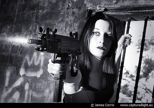
http://www.flickr.com/photos/captured_light/3168339669/in/set-72157603348085520/
I don't often work in black and white, but this picture of Marvada and her replica machine gun cried out for it. It was photographed on a sunny day but in a dark room, so the speedlites came out again to swap the lighting from window-inwards to room-outwards. I love being able to re-engineer light on set like that. The muzzle flash is a Photoshop extra - just in case I'm not bullet proof.
James' photography and writings can be found in several other places on the web, most notably his website, www.capturedlight.eu.
Then there is his flickr account www.flickr.com/photos/captured_light/and techie and photo blog: jordax.livejournal.com/
Wow what a start, think you want to be here on Tuesday, drop a message to us or comment on this post.
-blabpictures-


1 comment:
A really interesting interview, even for me as someone who knows your guest socially ;-)
FWIW I would be interested in being involved in Guest Tog Tuesday at some point, and I think I would provide a counterpoint to James's outlook to boot.
You can see my work here:
http://www.techno-mage.co.uk/blog/photos/
Hope to hear from you, and I will be reading the blog now that I know it's here :-)
Post a Comment