 Today is Tuesday and since we have a couple of entries in the blabpictures flickr group for the assignment set the other week then it's time for some comments on these 'cold' pictures.
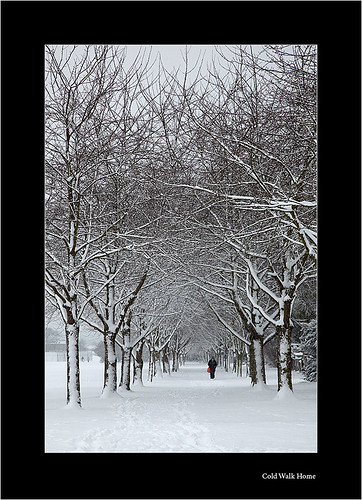
First up is lobsterboy66 with this image of a lone person walking along a snow covered path between the trees. The first thing that draws you to this picture is it's apparent monochrome nature, but then if you look at a big version the red bag being carried by the person proves the power of red in photos. I now can't start looking at this photo from anywhere else.
The sense of isolation from the person being so small in the frame relative to the avenue of trees is really good use of the scale. The composition using the tree lined avenue draws your eye through the picture and makes sure that you end up at that red bag one way or another. The snow that's been blown on to the sides of the trees still makes you feel as if the biting winter wind is in your face, and also helps the monochrome feeling by reducing the amount of dark elements around the lone person. I'm not sure if this was taken in the cold weather of last week, but it certainly fits the cold assignment.
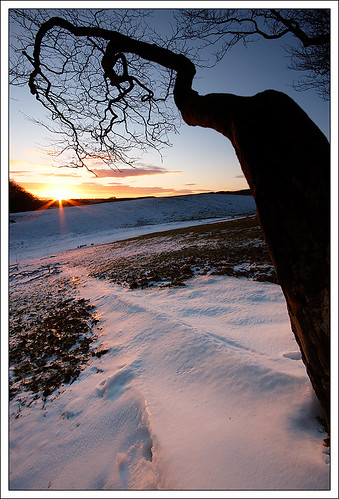
 Second one in the group is Alex Scott Photography with his tree reaching in to the snowy landscape. The tree is the key to his picture providing connection from the foreground to the back, and also connecting the ground and the sky. Having been outside trying to get some similar pictures I can still remember how cold it is out in the open for a few hours.
 Second one in the group is Alex Scott Photography with his tree reaching in to the snowy landscape. The tree is the key to his picture providing connection from the foreground to the back, and also connecting the ground and the sky. Having been outside trying to get some similar pictures I can still remember how cold it is out in the open for a few hours.
I like the sun light reflecting on the snow, and it shows that snow like most reflectors will take on the colour of the light hitting it. In this case the suns rays turn it orange and further back the blue sky cover have rendered it a cold blue tone. The second set of tree branches in the top right corner of the photo add to the picture, echoing the shape and direction of the main graphical element in the picture. I tried to imagine the picture with the top right corner just a patch of blue sky and realised that this composition is indeed much stronger. I also agree with Alex' choice of the slanted horizon, it's enough to convince that it's intentional and thought out without being too much slant.
Have your say, leave comments on this post or why not spread the flickr love and comment on the pictures in their photostreams.
-blabpictures-


No comments:
Post a Comment